Envelope Liners: What They Are and Why They're My Favorite

Most people are familiar with basic elements of a wedding invitation suite like the main invite or RSVP card. But I often get questions about some of the other components of an invitation suite. So I’m going to break them down… one by one.

2019-08-04 21.03.06.jpg

So what’s the secret to elevating your wedding invitation to the next level? The answer is simple, an envelope liner. 

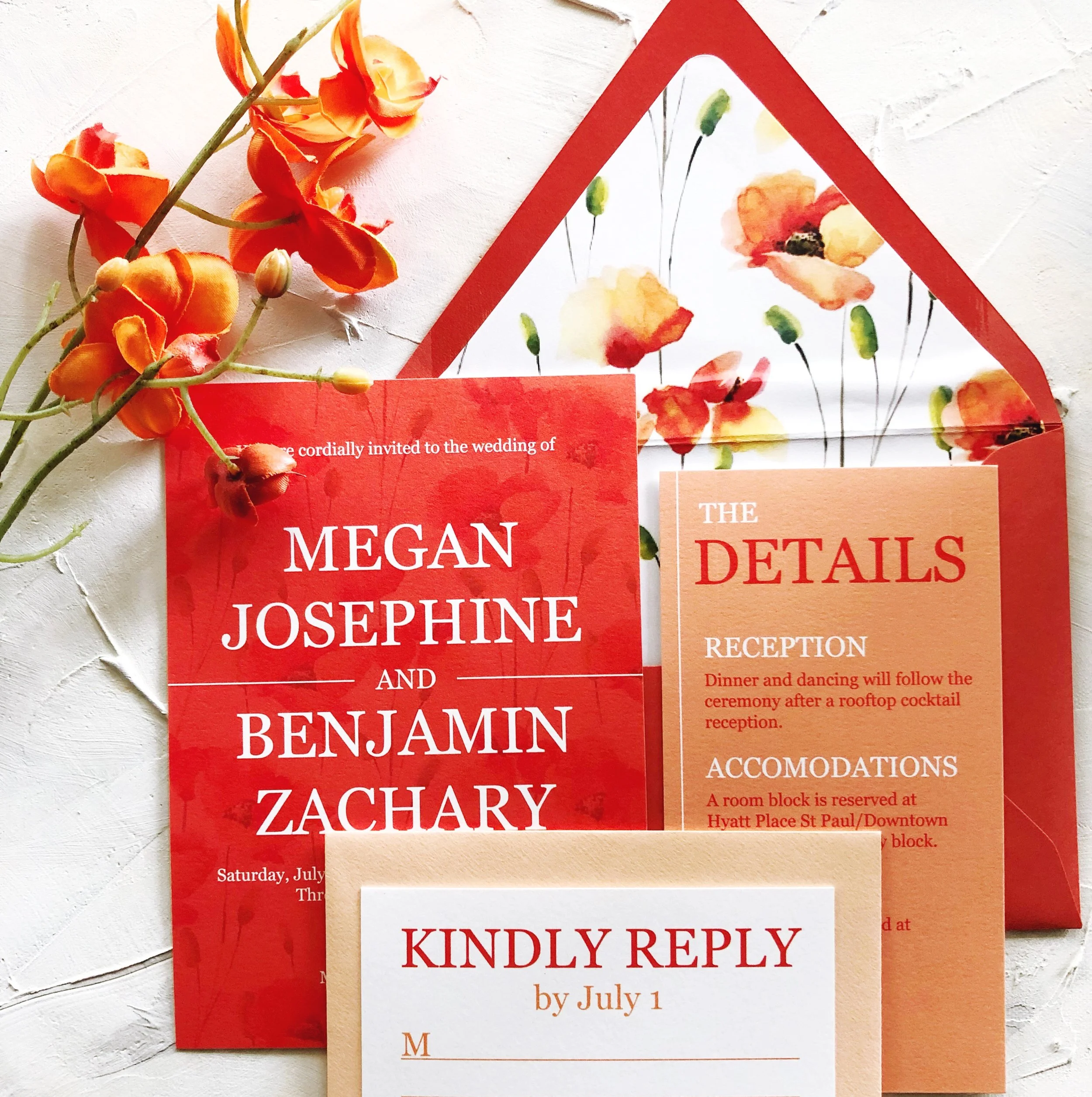
Let’s start from the beginning. Why are envelope liners a thing? From a function standpoint they serve to add another layer between the envelope and the cards inside to ensure that nothing shows through and interferes with the address printed on the front. With the addition of an endless array of envelope color options (bye bye only white envelopes!), the functional need for a liner may have decreased but don’t let that stop you from using a liner.

2019-07-24 19.54.51.jpg

From a simple solid gold to a watercolor illustration of your venue, the options are endless and impact is huge. Think of the liner as extra space where you can add one more pop of your personality to your invitation. Imagine inviting your guests to your tropical destination wedding and surprising them with an envelope that pops with floral leaves and fauna the moment they open their invitation.

2019-07-24+19.39.23.jpg
2019-08-02 21.17.46.jpg

Envelope liners start at less than $1/invitation and add so much impact, it’s easy to see why nearly every one of our recent couples chose to add one on to their suite!

Ready to see the unique envelope liner I’d design for your wedding? I am now booking 2020 weddings and would love to offer you a complimentary quote to get the process started. 

Cheers!
Carrie

Ready to chat?

Schedule your complimentary 1-hour wedding invitation consultation!

My Envelope Calligraphy Process

Envelope calligraphy is one my absolute favorite things to offer my clients, and when someone contacts me for envelope calligraphy, my heart does a little happy dance. And I can almost guarantee that your recipients' hearts will do that same little happy dance when they pull a beautiful, hand-calligraphed envelope out of their mailbox (especially if it's stuck between a bunch of bills and junk mail!).

I often get asked what the process is like for envelope calligraphy since most people have never worked with a calligrapher before - so that is what I am going to share with you today!

2017-12-10 13.58.01.jpg

STEP ONE | GET IN TOUCH WITH ME!

In order to book your spot in my calendar for envelope calligraphy, you'll first have to reach out to me with a few details. My calligraphy and hand lettering work is completely customized to fit your needs, and I therefore ask you to follow a certain process for reserving time in my schedule. When getting touch with me about envelope calligraphy and other calligraphy services, I ask that you fill out this questionnaire.

It has some basic questions to cover the following:

  • Your name and contact information, as well as where you are located (city/state) for shipping purposes

  • Information about your wedding that helps me suggest calligraphy styles to fit the event

  • The quantity of envelopes you want calligraphed

  • Size of envelopes being calligraphed

  • Type of envelopes (opaque, lined, shimmery, etc.)

  • Preferred ink color

  • Date of your event

  • Date envelopes need to be completed and in your hands by

  • Any extra services you want to add (wax seals and envelope liners are favorites!)

After you fill out the questionnaire, I will reach back out to you via e-mail with any other questions I may have. Once I have all the details I need, I will provide you with my availability, a custom quote, and 3 suggestions for calligraphy styles based on the style of your event. If you have a style of calligraphy you love, feel free to send it to me as inspiration.

2017-12-10 15.28.46.jpg

STEP TWO | LETTER OF AGREEMENT + RETAINER

Once you approve the custom quote and select your calligraphy style, we will both take a look at our schedules and set a start date. Once we have set an agreed start date, I will send you your 50% non-refundable retainer invoice and letter of agreement. The 50% retainer will be due before any calligraphy work can begin. The remaining 50% + any additional fees incurred will be invoiced once your envelopes are completed, and will be due before I can deliver the envelopes back to you.

STEP THREE | YOUR ENVELOPES + GUEST LIST

Once you have signed the letter of agreement and paid the 50% retainer invoice, I will have you ship your envelopes to me. If you don't already have envelopes, I would be happy to order envelopes for you at cost. I do ask that you provide 15-20% extra envelopes to account for ink splatters and/or human error. If you are local to the Rochester, Minnesota area, we can meet in person to exchange the items, letter of agreement and payment (if you prefer to pay by check). 

I will also need a digital typed copy of your guest list, in either a Word or Excel document (it will not be accepted in any other format). I am happy to provide templates for you, and a free addressing etiquette guide is available below. The document you send me will need to be completely spelling and grammar-error free, as I cannot be held liable for any errors in the document you provide to me. 

STEP FOUR | ENVELOPES COMPLETED + FINAL INVOICE DUE

Once your envelopes are completed, I will send you over your final invoice and an email letting you know so that we can arrange a time to ship them back to you. If you are local to the Rochester, Minnesota area or live less than an hour away, I am happy to meet up to exchange them in person. The final invoice will need to be paid before I can hand over the envelopes.

STEP FIVE | ENJOY!

Once the completed envelopes are in your hands, it's time for you to enjoy and then send them out to your guests! :)

Calligraphy holds a truly special place in my heart, and is something I absolutely love offering to my clients. If you are interested in calligraphy for your wedding invitation envelopes or special event, I'd love to chat!

Haley's Condo Reveal with Before and Afters!

Haley’s condo is finally done! I was going to break this up into 3 blog posts, but I have no patience and just want to share all of it ASAP. This is a long post, but scroll all the way through for all the before and afters!

It feels like we’ve been working on this for a really long time, but in reality, we designed, sourced, and installed a whole condo’s worth of stuff in a few short months! It was definitely a family effort, and lots of people played very important roles in making sure this all came together.

I’m so proud of Haley starting this new chapter in her life, and I’m thrilled that she has a pretty beautiful space to live in. Now I’ll cut the sappy stuff and get to the pictures!

Dining Room

Before….

After!

The dining room came together pretty easily. Haley was trying to balance buying furniture on a budget, but also wanted pieces that would last and be versatile enough to work in whatever the next space happens to be. We went with a basic, modern table from Target, but splurged a little on upholstered chairs from Schneiderman’s Furniture that will be comfy enough for long study sessions at the dining table or game nights with friends.

Although the light fixture in the room previously wasn’t the worst one I had ever seen, I wanted to have something that made more of a graphic, modern statement and provided more light since this is the only overhead light in the main common area of the condo. This one from Lowe’s was inexpensive but interesting and is the perfect size for above her table.

Because the only window in the space is the sliding glass door on the other side of the room, I thought putting some interesting mirror on the wall would be a good way to bounce some light around the space and make it feel bigger. The mirrors are from Ikea and ended up looking really high end! The rug is by nuLoom, but was purchased from Amazon and gave the room just enough color and a traditional vibe that warmed up the more modern elements.

Living Room

Before…

ISybj6m8qrm3m01000000000.jpg

After!

What a difference some paint makes, huh? This is definitely my favorite before and after of this space. Before the room was very dark, very brown, and the fireplace felt like it was awkwardly cutting the condo in half instead of being part of the room.

We painted the whole main area in Agreeable Gray by Sherwin Williams which is a beautiful slightly warm gray that still looks light and fresh in natural light while lending more warmth than white.

All of my fireplace dreams came true for this space because Haley is the best stenciler in the whole world!! Seriously. She used a tile stencil from Dizzy Duck Designs UK and it only took her about 8 hours! She said it was worth it in the end for the texture and depth that the fireplace has now. My dad built the mantel, and it definitely makes that fireplace wall look more intentional.

And although everyone thought I was crazy at first, hanging the curtains (found at Kohl’s for a steal!) extra high and the full length of the wall really used the room’s height to our advantage and made the sliding glass door look pretty opulent.

Ready for another brutal before shot?

After!

Seriously. If those two pictures don’t get people to start hanging their curtains right, I don’t know what will.

Getting Haley to pull the trigger on an indigo blue couch (also from Schneiderman’s Furniture) took a little bit of coaching, but I’m so happy that she pulled the trigger on it. This sectional is so comfy, and the blue gives the perfect youthful pop of color without being some obnoxious color that she will hate in 3 years. The coffee table is also from Schneiderman’s, but Haley found it on closeout and I don’t see it listed anymore.

To get a shot of color above the couch we hung large Ribba frames from Ikea and prints from Minted – I love the movement these coordinating abstracts give without being a “set”.

There isn’t a true entryway in the condo, but I wanted to create an entry moment where you can do one last check for stuff in your teeth and grab your keys and purse – and I LOVE that this acrylic and cement look console table from Hayneedle accomplished that without adding any extra weight to the room. That round mirror is from Ikea and is SO GOOD.

Another smart decision (if I do say so myself) was mounting the TV stand and TV to the wall and leaving room below for these adorable and functional poufs from Target (that are no longer listed but I thought about starting a petition to bring them back). The white Besta unit from Ikea provides some storage without taking up too much floor real estate.

Also, shout out to my first interior design love, Nate Berkus for making that great gold wall hanging piece for Target. It worked perfectly in the space to balance out the fiddle leaf tree.

Bedroom

Before…

After!

The bedroom was probably the biggest design challenge in the condo. Haley wanted it to feel cozy, but modern, and wanted it to be girly, but not too girly, youthful, but not too young… but I think we got to a good Goldilocks place with it.

All the bedding is from Target, aside from the large euro shams that my mom custom made to pick up the fuschia in the floral pillows. She also made the Roman shade (with pom-pom trim!) for above the desk. My dad made the bed frame(!) and the headboard was purchased from Overstock. The desk is Ikea and will give Haley a great, private place to Study, and that ladder shelf was a last minute Target purchase (good find, Rachel!).

The nightstands came raw from Ikea, but I painted them in an attempt at faux inlay, and I think they turned out pretty well. Those wall sconces are also from Ikea and I really love them.

Welcome home, Haley! I hope you love your condo as much as I loved working with you on it! And thanks again to all the friends and family that spent hours making stuff, shopping, painting, building, hanging, driving and generally rolling their eyes at me – it’s possible because of you!

An Update on Haley's Living Room: Accessories Matter

House-of-Goo-Cozy-and-Classic.jpg

It's only 3 weeks until littlest sister Haley moves away to Madison and into her grown-up condo. Because she's furnishing and decorating this place from scratch and on a budget, we've been spending a ton of time shopping, looking at fabric swatches and paint decks, and scrolling endlessly through the interwebs for the greatest and cheapest (fill in the blank).

I teased some concepts for her living room (and really her dining room and entryway because it's an open great room) a while ago and figured it was time to update you on how closely those plans had been followed and what we've bought. Most of your favorite design also happened to be hers, so we started from this "Classic and Cozy" concept.

I loved the idea of a mostly neutral and pulled-back space with some pops of color (blue couch!) and warm wood and leather. The aspirational part of this design was the notion of tiling the fireplace - we loved the look, but just couldn't justify the cost in a temporary home for a med-school student. Haley also really screwed up when she was budgeting and didn't budget for multiple leather Moroccan poufs which can easily cost $200 a pop. I tried to tell her that I needed EMERGENCY pouf money in the budget, but she's way more sane than I am about these things and said no. Lame.

I think Haley was like a lot of people who really struggle to make the first big purchase when staring at what is basically a blank canvas. She liked the idea of the blue couch but was hesitant to go with something non-neutral for the first and biggest investment in the space. And honestly, brightly colored furniture wouldn't be my recommendation in most cases, but we found this great, expensive looking fabric in just the right shade of blue, and Haley's fun side won over.

With the first big purchase made, a lot of other things came together quickly. The rug and chair matched the design plan pretty closely. Haley's not a big fan of mid-century, so we went looking for something more industrial for the coffee table, and she and my mom found a great one at Macy's, of all places.

And after a lot of looking for poufs with fairly specific requirements (not too tall, comfy to sit on, not requiring emergency funds) I found a great floor pillow at target. Now of course I only found one, and it was in an odd spot in the store, and they were sold out online and in all nearby locations. But middle sister Rachel came to the rescue and found one in a suburb of Milwaukee even after the store told her on the phone that they didn't have it - score! Here she is showing off her pouf hunting skills.

So with the "big things" purchased, I asked Haley how she was feeling about everything. Basically, she liked everything we had purchased, but was worried about the room/house being too masculine and serious. We hadn't gotten anything bright or cheery or girly or particularly young - so I got where she was coming from. Without any of the "extras" the room was coming together like this.

Looking at this, I understood why she was feeling that way - it was a whole lot of neutral without a lot of personality. I assured Haley that accessories would make all the difference. And guess what? They do! Even in a mood board before we have anything in the room.

Instead of making this post way too long, I'm gonna get fancy for just a second and show you how I plan on aaccessorizing the room with a nifty gif.

Well would you look at that - Girliness! Personality! A little youth!

Here's how this works in my head and the basic path we'll follow when we're actually loading in...

First, we found great paint stencils that are meant to give the effect of tile from Dizzy Duck Designs - she even ships fast and cheap from the UK! I was originally thinking we would do the stencil design in a charcoal, but I think the blue will balance out the space better.

Next, I picked some art to go in the big Ribba frames we purchased on our epic Ikea adventure. And honestly, 4 hours and 4 carts in Ikea on a rainy Saturday does qualify as epic. Here's a super cute picture of Haley to prove it.

The happy abstract art pieces are all from Minted. Haley was really struggling with what sort of art would work well, but the more I've looked, the more I keep coming back to these big shots of color that don't have subject matter to get sick of.

Because we'll have all these frames over the couch, I wanted to do something more sculptural over the fireplace. This big, brass line sculpture is from Target, and I think will be a good modern contrast to the more traditional pattern on the fireplace.

To bring the blushy tones from the art into the room, I added some vases that I got on clearance at Target a while ago. Next, I populated the mantel with a mix of blue glass from Ikea and some fake pink peonies that will look good all year long - ha. Plants are a must to soften up the space - even faux plants bring life and texture. And finally, a few throw pillows will bring everything together.

Just look a what a difference a few accessories can make! Of course, if she got sick of blush or wanted something more mellow all she would have to change is the art and swap out a few pieces. Now I just have to hope that Haley likes all this stuff. :)

Stay tuned for the reveal of the full space!

DIY Shibori Baby Blankets

20170409-DSC_0586.jpg

At various times of your life, your time gets consumed by certain types of parties. Graduation parties, college parties, then all of a sudden every summer weekend is consumed by weddings, and then later on you have an "OMG I'm old!" moment when you realize you have 8(!!!!!) friends having babies in the next 4 months. So, for me, it's baby shower season.

I happen to love babies, and love my friends, so this is actually pretty fun for me. I also happen to be a big proponent of getting your friends practical stuff off their registry that they actually want and will need, because obviously babies need a whole lot of stuff. BUT, I also think that including something a little more personal and handmade is sweet and makes the gift giving and receiving more fun.

So, with the baby showers nearing on the calendar, I decided I would use the popular Shibori technique on some plain white swaddling blankets. They turned out SO sweet and soft that I thought it was worth sharing the tutorial.

If you're wondering what the heck Shibori is, Andy says it is "fancy, non-hippie, tie dye - more folding, less swirling," and he happens to be exactly right. The technique is being used all over interiors, clothes, and although it's traditionally done using indigo dye, I love how it looks in any color. For example, here is Martha Stewart trying to sell you a $300 shibori shower curtain, naturally.

That dang Martha... she's good, but I promise you this shibori thing is really not hard. To start, pick up some Rit Dye and make sure whatever you want to dye is 100% cotton. I've done shibori on materials that are up to 40% polyester, and they've come out ok, but the cotton definitely handles the dye better.

Personally, I think the liquid Rit Dye is way easier to work with, and it's easy to mix a little at a time to get exactly the colors you want. The bottles say to boil water, but I just let my faucet run as hot as it would go for a little while, and that worked just fine.

A lot of people think of dye projects as messy, but this is about as easy as they get. (Don't ask Andy about that time I made him help me dye a whole rug. We were still dating then - I'm lucky we ended up married.) I just used a glass bowl in my kitchen sink and wore a glove so my nails didn't end up funny colors.

A couple of pro tips: I dip the corner of a paper towel into my dye bath to make sure the color and saturation are what I'm looking for. The colors often look totally different in the water versus on the fabric, and the colors always fade a little after a wash. Also, a lot of other online tutorials will tell you to use wood or foam board to sandwich your fabric after it's folded. I didn't want to spend the money on that stuff, and didn't have a lot lying around. What I did have around? Amazon boxes. So I cut cardboard to the shape I wanted and used that.

But let me back up a little: the graphic shibori patterns are created by using various types of accordion folds and sandwiching the fabric between materials that will cause the center of the folded design to resist the dye. You can find lots of instructions for various types of folds on pinterest, but my favorites are the geometric squares, rectangles, and triangles.

When you have everything folded and bound up, and your color just perfect, it's time to dip! Because you want the fabric in the middle of the design to resist the dye, it really doesn't matter if you can't fit your whole sandwich in the dye bath. In fact, I only dipped each edge in for about 30-45 seconds because I wanted the colors to be soft and muted and perfect for nurseries.

Once all your sides have been dipped to your desired saturation, rinse the fabric with really cold water to set the dye. I did this until the water ran pretty clear, and then cut the twine off the sandwich and peeled away the cardboard. The cardboard was usually starting to fall apart by now, but because I wasn't looking for super exact designs I was fine with it. Unfolding the fabric for the first time is like opening up a present! You're never quite sure what you're going to get, but it's usually pretty fab. Once the fabric is rinsing clear, I threw the blankets in the washer and washed with regular detergent on a cold delicate cycle and dried on delicate as well.

How cute did these turn out?! I don't know the genders of many of the soon-to-be-born kiddos yet, so I did a lot of blankets in gray and yellow and a few in blues, greens, and pinks. Hopefully there aren't 8 girls born, or I'll be dying more blankets! Or - there will be a bunch of tiny girl boss babies rocking their beautiful handmade blue blankets. Party on, little ones.