mood board

A Living Room with Personality for My Sister

House-of-Goo-Cozy-and-Classic.jpg

I'm baaaaaaaaack. I didn't mean to go into hiding for a year, but there was a wedding (future post on that later, but YAY for being a Mrs.), a job that has become pretty all-consuming, and you know - life in all its messy glory.

So why did I come back from my extended hiatus? Because I got a really fun job from the toughest client ever - my littlest sister.

Haley is starting medical school in the fall in Madison (whoop whoop) and just purchased her first condo. She doesn't want it to feel like a dorm room, but doesn't know much else beyond that. The only descriptors of her style that she's given me are "happy, colorful, and clean lines". Soo.. I'm pretty much starting from scratch.

Because I know my sister, I have established a few ground rules for the design of this place.

1) There's a time to be rustic, but this ain't it. This is a walk-up condo in a city, for a twenty something. I love Joanna Gaines as much as the next person, but a bunch of shiplap and milk crates just isn't gonna happen here.

2) There's a time for all white and sleek and museum-like, but this ain't it. There is only one person better at spontaneous napping and most-of-the-day couch sessions than me, and that is Haley. So a place that feels cold and too sleek isn't gonna work.

3) Haley's gotta feel happy there.

With all that in mind I put together 3 different looks for her living room... which when it was listed looked like this.

ISybj6m8qrm3m01000000000.jpg

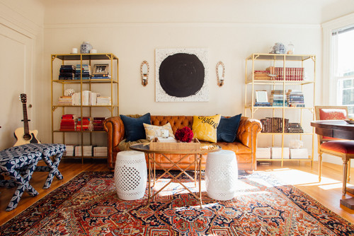
Because this is an open space to her dining room, kitchen, and hallway, the walls will be a light, happy neutral. No matter what, I think I want to do some floating cabinets or a long credenza along the wall to the left of the fireplace. I think this will square-off the room and make that inset space more functional. We (meaning me and my expert design and installation team - the fam) are going to wall-mount her TV where that too-small art hangs now (like the Homepolish image below). A couch will be where the current owners have their couch, but we'll put 2 chairs in front of the fireplace to make it one cohesive room.

Ok, so design plans - the fun part. I put together these mood boards so she could have a better idea of how stuff works together and the general feel of the space. Not every accessory is included, obviously, but I tried to make sure the major pieces were working together well.

Option 1

Rug | Couch | Chair | Coffee Table | Lamp | Curtains | Art | Poufs

For all of these spaces, I want to take the flimsy white framing off the current fireplace and have my dad (the furniture-maker extraordinaire and handyman of this operation) put in a chunkier wood mantle to make it feel more finished. I don't want to say too much about my thoughts on each design, because I want to hear what you (and of course Haley) thinks first.

While we're talking about family roles in this endeavor, let me try to draw some HGTV parallels for you so you understand the dynamics. Here's our cast of characters for Dysfunctional Design:

Carrie (me): The designer (I still cringe every time I call myself that) with lots of ideas and plans. Mostly concerned with look and feel of spaces, not so concerned with logistics, budgets, how to make things happen, etc. You know who I really miss on HGTV? Genevieve. She was a classic.

Haley: The client, obviously. She's not nearly as annoying as those people on House Hunters that only care about granite countertops and paint colors, but she's also not real decisive. Anything to make her happy!

Mom - Jaci: My mom is like that semi-annoying design assistant that doesn't get much camera time, but does most of the actual work. (shout out to Dessa on Love It or List It!) She's chief list-maker, budget watcher, painter, installer, problem-solver, etc. etc. I'd be lost without her.

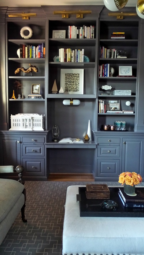
Dad - Dan: Ty Pennington, Chip Gaines, take your pick for ruggedly handsome man wielding a hammer and saw. That's my dad. He makes beautiful furniture (like these built-ins - still love them!) does what needs to be done, and in this case does all the real life-saving work that helps to fund these little endeavors for his girls. His only fault is that he's not always real quick to concede that something needs to be done by a pro...

Andy: Super helpful, but not super handy. He's great at holding the dog when it gets scared of the air compressor, running to store for that thing we forgot when we were there the first 8 times, holding and carrying stuff... He really is pretty helpful, but we like to give him a hard time. Love you, hubs, but this is real talk.

Rachel and Andrew: The sister and her hubs in Milwaukee may make an appearance and get a spot on the "show", but they're probably smart just to skype every now and then, give a critique, and then go back to their sane lives and leave us to figure out what to do next. Actually, now that I think about it, they're like the subcontractor that walks in half-way through the demo says "this isn't gonna work, here's my bill, see ya." That's the sweet life right there.

That was an odd little tangent...back to the design.

Option 2

Rug | Couch | Chair | Coffee Table | Lamp | Curtains | Mirror | Poufs

My mom the budget watcher might hate me for suggesting we tile the fireplace, but seriously... how great would that look with a pretty cement tile? The patterns would probably be a slightly smaller scale than this, but I think this space could use a showstopper focal point, especially if we keep the rest fairly neutral.

Option 3

Rug | Couch | Chair | Coffee Table | Lamp | Curtains | Mirror | Poufs

This is definitely the girliest option, but if Haley and a potential roommate have this bachelorette pad for awhile, why not girl it up a little bit? This fireplace is tiled again, but this could easily be a geometric patterned wallpaper too.

Ok - if you've managed to hang in there through this much of rambling, you get a reward! Vote below and let Haley know which option you would pick. Or - leave a comment and let me know what you love or hate about any of them. Ready, go!

Office Update: A Peek into My Design Process

office-mood-board-e1451964085770.jpg

When I bought my house, I was thrilled that it had a fairly large "extra" room in the front corner of the house. It has beautiful french doors that open from the dining room, and it's really the only room of my house that gets great natural light for a good portion of the day. So of course, I quickly claimed it as my office/work space/den.

I wanted to share the plans for the office, but I also wanted to share my design process (if I can even call it that) so that others can follow the same formula and love their own spaces!

1. Pull together images that speak to you

When people come over, or I share some of my work, the most common question I get asked is "how do you come up with these ideas?" My answer - and it's a truthful one - is always the same. I steal them.

All designers/stylists/decorators/creatives are constantly immersing themselves in other people's work and being inspired by a variety of sources. I would never look at a feature in House Beautiful and decide to attempt to duplicate a magazine spread in my house. But I would take a bunch of the different elements that leap out at me and put them together in a different way or with a twist.

When I started thinking about redoing my office I scoured pictures of offices, dens, and sitting rooms without searching for anything in particular. Most of the stuff was pretty "meh" to me, but there were definitely images that peaked my interest.

San Francisco Decorator Showcase 2015 // His Office // Brittany Haines

A LOT

Things I like (based on those photos):

  1. Bright spaces that make good use of natural light
  2. Masculine "den"-type spaces. I think a lot of this has to do with having very fond memories of hanging out in my dad's den with him as he worked, or had patient, in-depth conversations with my 10-year-old self about current events or the mysteries of the world. Or how there were certain classic songs you should always play REALLY loud.
  3. Lots of space to display books and other special, inspiring items and collections.
  4. A mix of modern and traditional pieces.

That's a lot of info from just looking for patterns among a handful of pictures!

Next step...

2. Decide what elements you can't live without

All of those design ideas are nice.. but how do you start to actually conceptualize the room? For me, I figure out what I can't live without. This is where you switch to thinking about function instead of aesthetics.

Things I need in the space:

  1. A large, clean work surface to be able to spread out on
  2. A couch to do more passive work, lounging, and reading on.
  3. Shelving to store and display books and treasures
  4. Plenty of lighting to encourage productivity on short winter days

3. Plan the space

There are lots of great tools available to visualize and plan floor plans. My personal favorite is just good old graph paper and a pencil, but I've also used and appreciated floorplanner.com because it's free, pretty user-friendly, and has standard sized furniture built in so you can just place items and move them around your room. For people that have trouble visualizing flat shapes as three-dimensional spaces, it has a nifty feature that lets you "tour" the room.

Quick tip: Furniture always looks bigger in a 3d space than it does in a floor plan. If your floor plan feels a little sparse, it's probably about right.

If I'm really worried about the scale of furniture or making a lot of pieces fit, I take the time to draw everything to scale. But in this room I knew I had quite a bit of wiggle room, and just did a quick sketch of the layout in powerpoint.

4. Design the "look" of the room - mood board time!

So you know what you like, you know what you need, and you know the big pieces you need in the space and how they'll lay out. The best way to make all of those things start to gel into a "look" is to put a bunch of potential elements together in a mood board and start editing until you're happy with it.

Here's the mood board I created for my office space:

I did this in Photoshop by copying and pasting a bunch of images together after removing their background "stuff". I also use Pinterest and other inspiration board-type websites, but I still find that actually seeing all of the elements together in one space is most helpful.

I knew I wanted a comfortable, leather couch in a warm brown color to bring in some of that masculine-den feel. I won't be able to afford an actual Chesterfield like I have pictured here, but I'm hoping to find something in that vein.

I've decided to use a cowhide rug in the space because a) they're super durable b) to get a rectangular rug large enough for this space would be cost prohibitive (see my previous rant on expensive rugs here) and the irregular shape of the cow hide allows you to cheat the rules a little bit and c) I really need something to break up the expanse of Brazilian hardwood floor that I didn't pick but can never get rid ofbecause it's expensive and looks nice enough I guess. <-- sorry about that long run on sentence, Haley. (she's decided she's my blog editor. I think it's because she likes pointing out my faults. Little sisters, I tell ya.)

I want a large, somewhat rustic desk. I don't like the feel of working on flat, white, shiny plastic. It feels too much like actual work then. I guess it's a personal thing. BUT, cowhide, leather, rustic wood.. this is all starting to sound a little den meets dude-ranch, which of course is not what I'm going for. A sleek white chair, Moroccan pouf, and gallery wall made up of gold frames all help to add a little girl back into the equation.

The finish of the shelving was a tough spot for me... I don't want too-perfect, cold, white shelving, but I also don't want to introduce any more wood tones or masculinity into the space.

One of my favorite (but small) collections, and the one I was most excited about putting in the space is made up of a bunch of vintage jadeite bowls, candy dishes and vases. Adding some of that type of finish into the mood board spurred me to think about staining wood cabinets and shelving a girly color, and wouldn't you know it, Minwax makes a beautiful warm minty green stain called antique jade. Instead of having the jadeite contrast with the shelving, I think it will only highlight to put it on shelves that carry the color throughout more of the room.

5. Source and gather the pieces

Reasons to shop - yay! Needing money to get what you want - sad trombone. Sooo... now I'll start the process of accumulating the items I want in the space, and attempt to be patient enough so that I don't have to eat ramen noodles while staining cabinets. I'll update you on the progress of the office when there's something to update you on!

What spaces in your house have you stumped? How is your design process different than mine? I'd love to hear about it in the comments!